[ad_1]
Clever logo designs can be a game-changer in attracting new customers. They’re often the first thing that catches the eye, so making a cool and impactful impression quickly is crucial. The best logos come with hidden meanings, adding an extra layer of intrigue.
For instance, think of the FedEx logo and its subtle arrow between the ‘E’ and ‘X’, symbolizing speed and precision. Or consider the Amazon logo, where the arrow points from A to Z, representing the wide range of products they offer.
Personally, I have a soft spot for these kinds of designs – logos that cleverly embed meanings related to the product or service they represent. These 50 examples below make me want to walk right in and hand over my cash.
1. Letter “H” looks like chopsticks picking sushi.
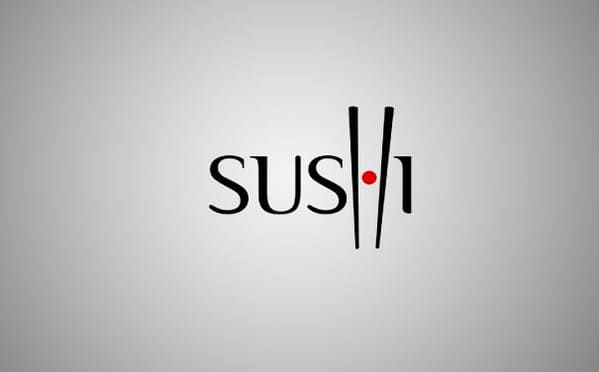
 Designer: Type08
2. Letters “c” are also cat’s eyes.
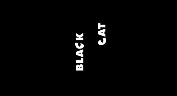
 Designer: vasvari
3. The scissors are transformed to look like a face with glasses and mustache.
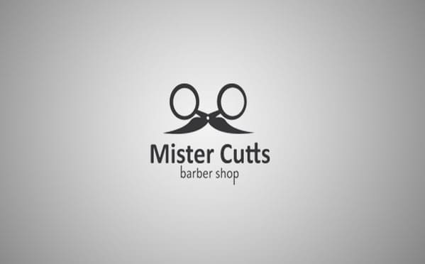
 Designer:Tabitha Kristen
4. A swarm of bees forming a “B”.
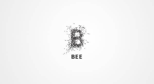
 Designer: AlexanderSpliid
5. Mosleep is an organization of doctors that helps people with sleeping disorders. The logo is their initial ‘M’ that was designed to also look like a bed.

 Designer: Muamer
6. The mouse cursor and the dot forms a sign of a female.

 Designer: scala_humana
7. The letter “i” is lying as if it was killed.
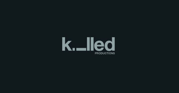
 Designer: Ethereal
8. There’s a hidden tie in the logo.
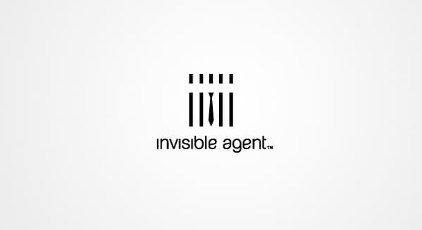
 Designed by AlexWende
9. The woman is making a pose that forms the Australian continent between her leg and her arm.
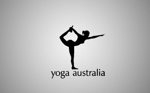

10. The golf ball is lit like a moon.
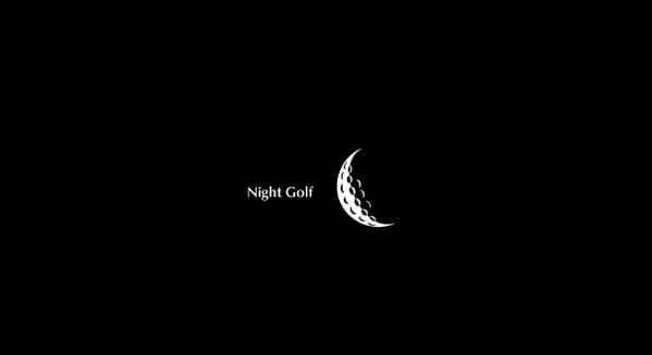
 Designer: MikeyMike
11. A hanger looks like a duck.
 Designer:Siah Design
12. The missing puzzle part is also a pictogram of a human.
 Designer: Matto
13. Both letters “i” are missing.

 Designer: JoePrince
14. The clock’s arrows are also a plane.
 Designer: firebrand
15. The right-pointing arrow in between the ‘E’ and the ‘x’, representing the precision and speed at which FedEx works.

16. Falling man and hand at catch moment.
 Designer: Matto
17. The book is shaped like a cup of coffee.
 Designer: Macarotti
18. Logo created from a B and L forms a heart and 2 birds.
 Designer: Logomotive
19. Box + Chair.
 Designer: Logomotive
20. Cloud server company, it’s like having your private “corner” in the cloud.
 Designer: peclat
21. Half
 Designer: wunjo
22. The fish is formed of various computer symbols.
 Designer: mabu
23. Cow + zebra.
 Designer: Tom Merckx
24. Moon

 Designer: JoePrince
25. A logo that stands out from the crowd.

 Designer: !mude
26. Letter “i” has some problems standing up.
 Designer: mabu
27. “The arrow from A to Z, symbolizes what Amazon is known for selling everything from “a to z”. It also serves as a smile, making the company feel friendly and approachable.”


28. Letters “w” and “m” look like piano keys.
 Designer: Patrik A.
29. Letter “f” is rotated to look like a plane.
 Designer: holajoan
30. There’s a dolphin’s flipper cut out of the square.

 Designer: Ico Design
31. There’s a moon shape made of coffee foam inside the cup.
 Designer: azdesign
32. There’s an elephant trunk inside the letter “e”.

 Designer:m1sternoname
33. Logo for a brewing company targeting adult male screw-ups who feel they’ve been put in the “doghouse.”
 Designer: JohnBoerckel
34. Notice that the word “bar” is darker.

 Designer: Sean Heisler
35. Those 3 letters in the middle ‘i’, ‘l’, and second ‘i’ represent a family (father, mother and a child, or 2 fathers and a child in some countries).

36. Drop of ink + glasses.
 Designer: OcularInk
37. Empty space in the middle creates a number “1” for “Formula 1″.

38. Letters “g” are made of eggs.
 Designer: creattica
39. Literally unarmed silhouette of a man.
 Designer: JoePrince
40. Fish Silhouette.
 Designer: Levogrin
41. “Notice how the space around the plane forms the letters C and D.” (Tobias)
 Designer: Logomotive
42. If you look more carefully, you should also see 3 bottles of wine.

 Designer: jeriahblau
43. There’s a hidden Christmas tree inside the letter “X”.

 Designer: Dalius Stuoka
44. The lens of the camera is also a plate.

 Designer: Siah Design
45. Circus tent looks like a magazine (more like a book to me, but still very clever).
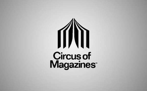
 Designer: logotomy
46. Just looking at the logo makes you want to press “backspace” and correct the typo.
 Designer: JoePrince
47. “The question mark is made of a belt.”
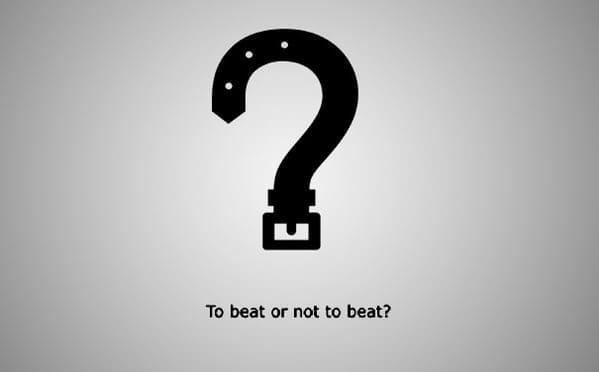

48. The Logo depicts ambiguous emotions.
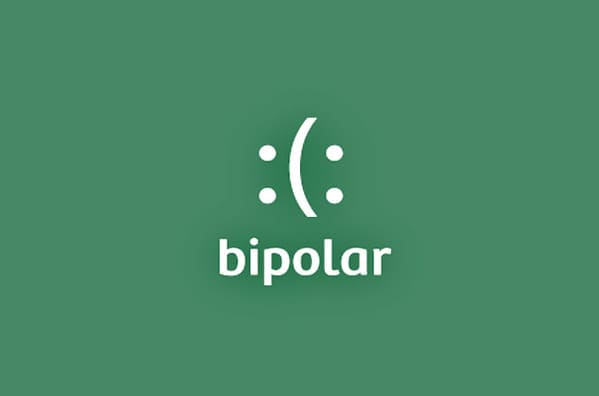
 Designer: Siah Design
49. Letter “B” is also a bird.

 Designer: Peter Varsvali
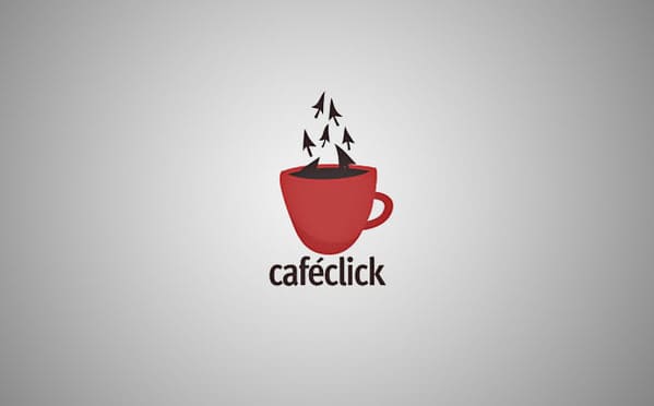
50. Coffee steam is made of mouse pointers
 Designer: Leo
[ad_2]
Source link
Jarastyle – #Genius #Logo #Designs #Hidden #Symbolism
Courtesy : https://pleated-jeans.com/2024/01/10/clever-logo-designs-hidden-meanings/

